We’ll just come right out and say it: If your business’s website isn’t optimized for mobile, it needs to be — immediately.
Seventy percent of internet traffic originates from smartphones. (That might sound shocking, but it shouldn’t, given that we spend, on average, about five hours each day on the handy little devices. Sixty-one percent of people will never visit a non-optimized website a second time. And 40 percent will head straight to your nearest competitor if your site doesn’t display correctly.
Yes, mobile optimization really is that important.
Why Mobile Optimization Matters
Seventy-six percent of people visit a business’s website before visiting the business itself. That means your website is your first impression, and … well, you only get one of those.
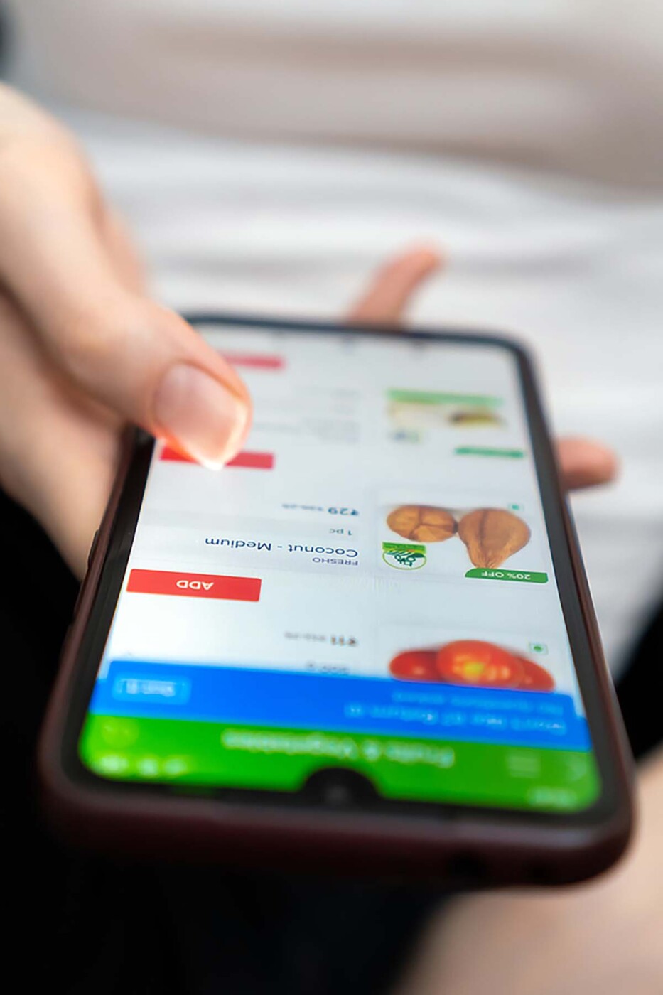
Your website might look fantastic on your office’s 17-inch monitor, but your customers aren’t in your office. They’re viewing your site on a 6-inch screen, and that’s a big difference.
Links so squished together that they’re impossible to click, text so tiny that you have to zoom in to read it, and videos that load at the speed of molasses don’t exactly instill confidence in your business as a whole.
Your audience aside, there’s one more big reason why your site needs to be optimized for mobile: Google wants it that way. The reigning king of search engines has decreed that non-optimized sites are a no-no, and it has no problem penalizing these sites for their inhospitality.
Tips for Optimizing Your Business’s Website
Now that we’ve covered the why’s, it’s time to move onto the how’s. Here are some best practices for optimizing your website.
Use a Responsive Design
A responsive design means that the layout of your website will change depending on the screen it’s being viewed on. It’s the same content, but things will automatically shift and scale from one device to another.
King Google prefers sites that use responsive design, as they’re typically more mobile-friendly.
Prioritize Video Over Images
Images can get tricky on mobile devices. Large image files take too long to load; compressed image files are quicker, but not as pretty. Placement can be difficult, and they take up plenty of room on smaller screens.
Instead, prioritize video. It’s more interactive, easier to navigate, and most people prefer it over images or text. In fact, videos get 1,200% more social media shares than other mediums.
Concentrate on the Checkout
Arguably, the most important part of your mobile website is the part where people give you money. So your checkout page needs to be flawless. Hard-to-fill forms, glitchy payment portals or forcing someone to create an account instead of allowing them to check out as a guest leads to abandoned shopping carts.
Do all you can to speed up the process, don’t ask for more information than you need and make the purchase point as simple as it can possibly be.
Keep It Clean and Simple
Mobile users do not want to look at a wall of text. When it comes to mobile optimization, less is more. Keep your design clean and simple. Make use of white space. Include only the most important components. And make sure it’s easy for a visitor to get in contact with your business.
Consider adding a “view desktop version” button to your mobile site. This allows people to choose which version they see and puts them in control of how they use your site.
Mobile Optimization Is Non-Negotiable!
Optimizing your business’s site for mobile users isn’t something to put on your “whenever I get around to it” list — it’s something that needs to take top priority. Your audience — and Google – want it right now.
Need help getting your website on smaller screens? Mischa Communications has a team of tech-gurus standing by. Let’s get started.