Have you ever visited a website and immediately felt like something just “clicked” with you? Well, it’s entirely possible that magic came from the simplest of sources: the colors.
Yes, color psychology is a real thing, and it can be a game-changer when it comes to branding, advertising, and website design.
According to HubSpot, 93% of consumers make purchasing decisions based on visuals alone, and color makes up 90% of that initial impression. Add in the fact that color ups your brand awareness and recognition a whopping 80% and it becomes crystal clear that the hues you choose matter more than you think.
If you’re ready to make a lasting impression on your audience, it’s time to drag out your Crayolas and hit the coloring books.
Why Colors Matter in Branding
The world’s most iconic brands understand the power of visual marketing.
McDonald’s vibrant yellow seems cheerful and welcoming. Visa’s bold blue symbolizes reliability and trustworthiness. Coca-Cola’s red sings with passion and excitement.
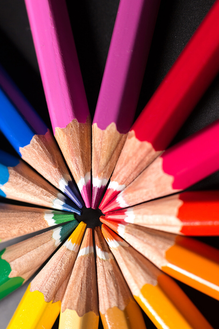
Colors don’t just make things look pretty; they evoke emotions and create connections. And if you’re curious about what each color stands for, here’s a quick cheat sheet:
- Red: If you want to radiate energy, red is your go-to. It’s passionate, bold and attention-grabbing. Plenty of fast-food restaurants (think Chick-Fil-A, KFC and In-N-Out Burger) use it because the color has been scientifically proven to stimulate people’s appetite. Red can also be used to symbolize urgency or danger.
- Blue: Blue can be used to signify professionalism, security and trust. Brands like Chase Bank, LinkedIn and Blue Cross Blue Shield use it to communicate dependability and promote a sense of peace.
- Yellow: Yellow conveys happiness, optimism and strength. From the iconic McDonald’s logo to Ferarri’s prancing horse, the color promotes confidence and extroversion. However, it also can be used to invoke a sense of caution, fear or anxiety in your audience.
- Green: Green is the color of choice for many eco-friendly and wellness brands, signifying life, health, freshness and growth. Whole Foods, Greenpeace, Starbucks and Holiday Inn all use it to their benefit. Green is also the color of money, so unsurprisingly, many banks — including Huntington, M&T Bank, and Citizens Bank — rely on it.
- Purple: If you’re looking to position your brand as sophisticated, wise or dignified, purple may be a good choice. Not many brands use it, so it can also help you stand out in a crowd. Curves, Hallmark and Scentsy have leveraged it to appeal to a female demographic.
- Black: The color of luxury, security and substance, black makes a bold statement. Sleek and refined, it’s the color of choice for brands like Chanel, Gucci, Prada and Louis Vuitton. However, because it can also symbolize negative connotations like oppression and evil, it doesn’t work for every industry.
Using Colors in Advertising
Ads are all about grabbing attention, so the right colors can stop people in their tracks. But it’s not just about standing out – it needs to align with your message, too. Some tips:
- Create contrast: Contrasting colors can help highlight key messages. A bright orange “Shop Now” button on a navy blue background will naturally draw the reader’s eye.
- Set the mood: Are you trying to create a sense of urgency? Bright red is a great choice. Are you selling relaxation? Calming blues and greens should do the trick.
- Know your audience: Who are you speaking to? Millennials might vibe best with bold, vibrant colors, but older audiences might prefer softer, more traditional tones.
- Consider the culture: Remember, colors can mean different things in different cultures. For example, in the Western world, white symbolizes innocence and purity. In the East, it’s commonly associated with death. If you do business globally, it’s important to take this into consideration.
- Test and tweak: Use A/B testing with different color schemes to see what resonates best with your audience.
What’s Your Favorite Color?
Colors are more than just decorations. They’re a secret weapon in your branding arsenal. Choose them wisely and watch your brand becomes more memorable!
Do you need some help painting your brand’s story the perfect shade? Mischa Communications can make it happen. Let’s get colorful!