Every time you send an email, make a social media post or create a paid ad, you choose where your traffic is directed when a potential customer clicks on it.
You can link them to your website homepage. You can link them to a particular product description page. You can even link them straight to a competitor’s website if you choose. (But we certainly don’t recommend it!)
The point is, you get to choose where your traffic ends up — and if it’s not ending up on a designated landing page, you’re doing it wrong.
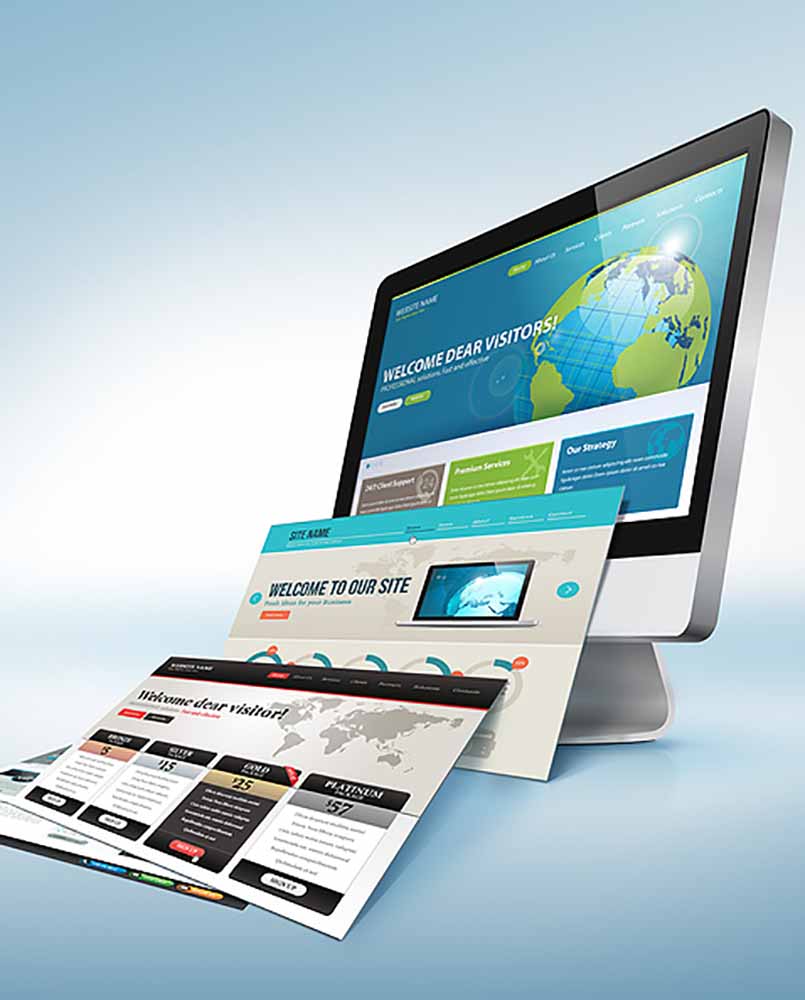
A landing page is a page designed to get visitors to complete one specific action, whether it’s signing up for a free trial, downloading a gated resource, joining the mailing list or scheduling a demo.
It also has no distractions. There are no rabbit holes to fall down and no navigation buttons to lead people astray. It’s a simple, straightforward way to get people to do what you want them to do — because there’s nothing else to do on the page.
Ready to learn the basics of landing page design? Here we go.
Landing Page Layout
When it comes to the layout of your landing page, your best bet is to employ the KISS method: Keep It Simple, Stupid.
All of your information should be above the fold — that is, no scrolling required. Leave plenty of white space. Use bullet points where it makes sense. Don’t do anything that pulls the visitor’s attention away from your main goal.
There are plenty of landing page templates online, both free and paid. Some are better than others, and your milage may vary. Although it’s always best to use a professional to create your landing page, a well-researched DIY approach can work, too.
Finding the Right Words
Every landing page needs a carefully crafted call to action. Your visitors have arrived; what do you want them to do now?
The copy you use will naturally depend on what your CTA is. If you’re trying to get them to sign up for a free trial, you might want to include social proof from existing users. If your goal is to get them to download an eBook, an overview of the content or an excerpt would be welcome.
The voice you use on your landing page should mimic your brand as a whole. If your brand is professional, use professional language. If you’re going for a casual, laid-back feel, make sure your landing page represents that.
Above all, make sure there is no question about what your visitor’s next step should be. For example: “To receive your free sample, please fill out the form below.” Yes, that might seem obvious, but it’s best to be certain that every potential customer knows exactly what to do.
Tracking the Success of Your Landing Page
Your design is flawless, and your copy is perfect. But if you think it’s time to sit back and crack a cold one, you’re very, very wrong.
A landing page isn’t a set-it-and-forget-it proposition. You need to be constantly monitoring, tracking and tweaking your pages. How many conversions are you getting? Where is most of the traffic coming from? Do people respond better to the word “free” or the word “complimentary”?
Your existing marketing software probably has built-in ways to track the success of your landing page; if not, Google Analytics will show you which landing pages are converting and which are falling flat.
The important thing is to try, try again. What worked well last week might not be working at all next week, so avoid getting complacent.
Is Your Landing Page Landing Your Small Business in the Spotlight?
A designated landing page is one of the best ways to get your visitors to convert. But just any old cobbled-together thing won’t do. Take the time to make your landing pages phenomenal and you’ll be enjoying increased conversions, leads and sales in no time!
Whether you’re woeful at all things website-related or just don’t have the time or energy to handle one more task, Mischa Communications is at your beck and call. Ready to get started?
