Choosing a font for your small business website and marketing materials will never be the most exciting part of your day. Squinting at a screen as you switch from Arial Nova Condensed to Arial Nova Light, trying to determine which one looks best, is enough to have anyone reaching for a bottle of Advil.
But as mundane as it might seem, finding the right font family for your small business is far more important than you think.
Most of us don’t consciously notice fonts. We do, however, notice the emotions that they invoke in us. The fonts you choose send subliminal messages to your audience. The right ones help your brand; the wrong ones hurt it.
Imagine you’re in the market for a new accountant. A quick Google search brings up a firm near you. Their reviews are great, their fee schedule is attractive and they’re offering a deep discount for new clients. However, when you visit their website, everything is written in Comic Sans. It no longer matters what they’re trying to say; the waythey displayed it is so unprofessional that their entire message is ruined.
So, what makes a good font for your small business — and how can you ensure that it helps your brand rather than hurts it?
We have the scoop.
Use Fonts to Set the Tone
Think about Disney. The font alone makes the logo instantly recognizable. You could write anything using that font, and “Disney” would enter a person’s mind before they ever read the text.
Fonts help set the tone for your small business. In Disney’s case, the chosen font signifies something fun and whimsical. It works for its brand.
Who are you as a small business? What’s your story? Are you established, reputable and respected? A traditional serif font may serve you best. Are you free-thinking and artsy? You might consider incorporating a decorative script font in your logo or marketing materials.
Whatever you choose, know that it’s a direct representation of your business — for better or for worse.
Consider the Readability Factor
We’ve all been there — pinching and zooming our screens, trying to read a blog post written in five-point type or a “fun” cursive font. More often than not, we give up, rendering the business’s efforts useless.
Your font choices may be nearly endless, but that doesn’t mean they’re all goodchoices. The aesthetic doesn’t matter if no one can read what’s written without a magnifying glass or a migraine.
When choosing your fonts, make sure they’re easy on the eye. Preview them on different devices. What looks great on your laptop may not look so fantastic on a tablet or smartphone. Readability should always be a high priority!
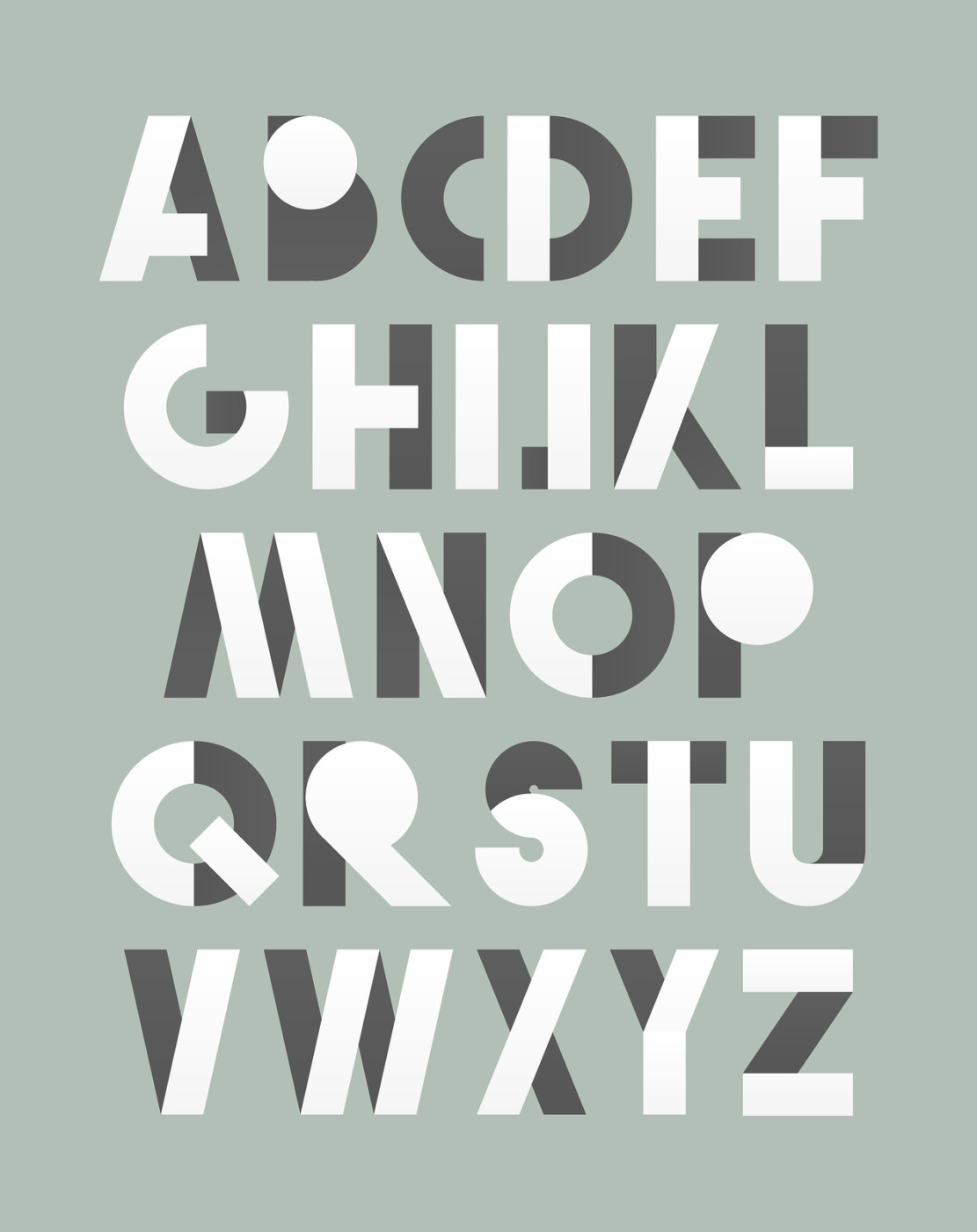
Think Outside the (Font) Box
The problem with popular fonts is that they’re … well, popular. Everyone uses them.
But you’re not “everyone.” You’re unique. And sometimes, that dropdown box in Word just doesn’t have what you’re looking for. In this case, you may want to consider custom-drawn display fonts. Your friendly neighborhood graphic designer can help you create something that’s yours and yours alone, allowing you to stand out from the crowd and make a huge impact!
It’s More Than What You Say — It’s How You Say It!
Like it or not, the fonts you use for your small business tell a story. Don’t leave the ending to chance! Spend some time ensuring that the visual impact of your message shines just as brightly as your message itself. You won’t regret it!
Is your small business ready to make a big statement? Mischa Communications can help! Let’s get started today.