Pop quiz: How long does it take the average person to form an opinion about your website? Fifteen seconds? Ten? Three?
Try 50 … milliseconds.
You read that right. When someone visits your website, their mind is all but made up after a tiny fraction of a second.
Not sure if your homepage is good enough to pass that admittedly difficult test? These tips will help make your website shine.
Keep Important Info Above the Fold
“Above the fold” is journalism speak for keeping the most important information where it can be seen without the reader taking any action at all. With newspapers, it literally means keeping your most important story above the physical fold. With websites, it means keeping the most important info front and center without requiring your visitors to scroll.
Only you can decide what information is the most important. For some small businesses, it might be your contact information. For others, it might be a “buy now” button for your featured product or service.
Whatever it is, make sure it’s the star of the show!
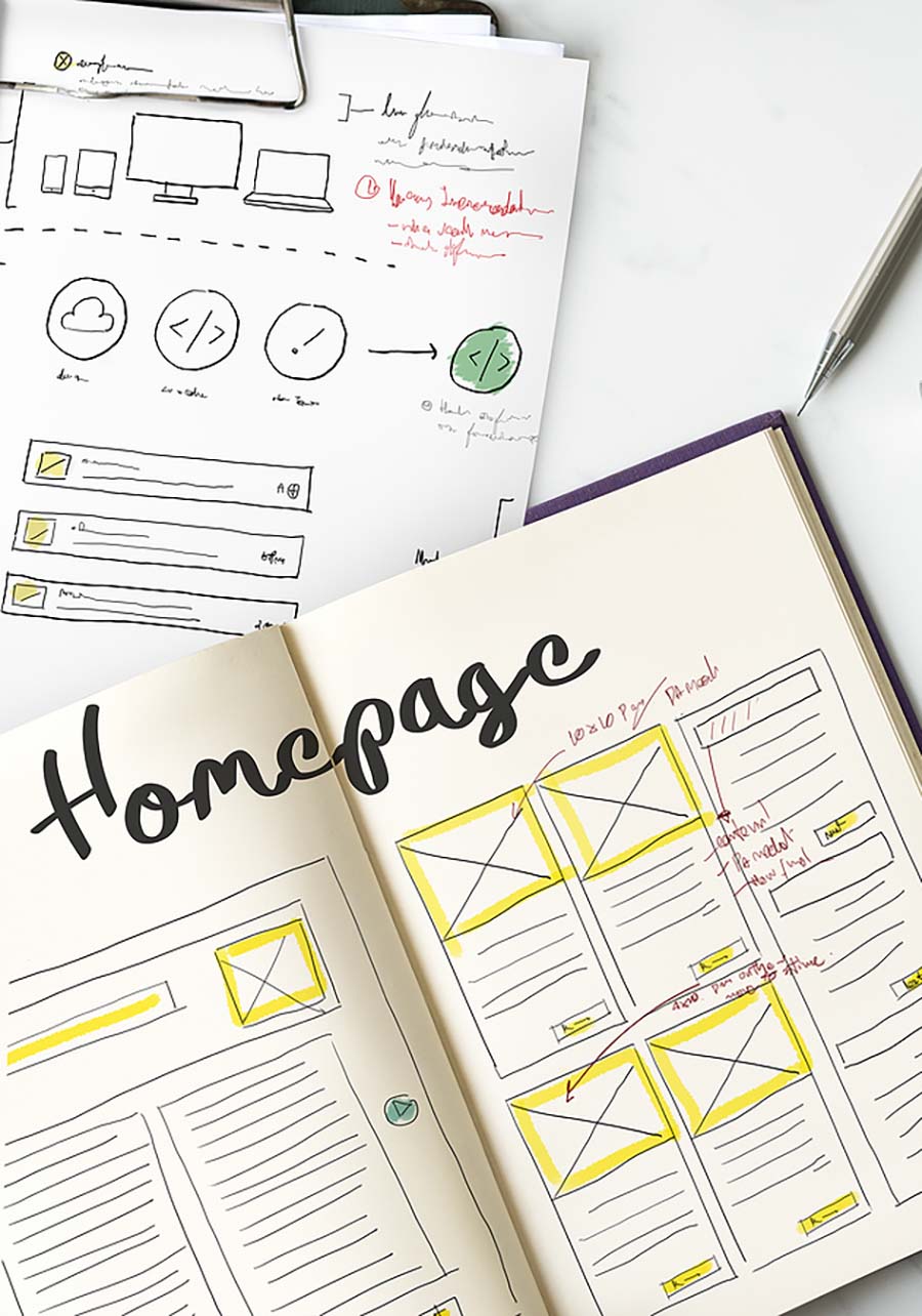
Know How Your Homepage Looks on All Devices
It’s easy to pull up your homepage on your laptop or iPhone and say “Yep, this looks great!” But how does it look on a tablet? What about on the newest Samsung Galaxy? Can you read it on a small screen without having to pinch and zoom? Is it heavy on graphics, causing it to lag on older devices?
You need to know how your homepage looks (and functions) on as many different devices as you can test. Click every link. Visit every page. It also helps if you have a few trusted friends or colleagues do an independent review on their preferred devices. More eyes are never a bad thing!
Have a Clear Call to Action
You’ve ensured that your homepage looks great on everything from your shiny new smartphone to your grandma’s ancient desktop that has never run anything more complicated than Solitaire. You’re ready to go live, right?
Not so fast. Without a clear call to action, all the work you’ve done up to this point is lost in translation.
When a visitor arrives on your website, what do you want them to do? What is the next step they should take? Should they request a quote or a demo? Learn more about your flagship product? A little handholding goes a long way, and providing your visitors with a very, very clear CTA is the best way to ensure you get results.
Be a Bit Mysterious
While a clear CTA is an absolute must, it’s OK to leave a bit to the imagination as well. After all, you have plenty of other pages on your website — the homepage just happens to be the first one they see.
Want to subtly direct them to your product pages, About Us section, FAQs or blog? Instead of basic boring links, pique their interest with headlines like “Find your new favorite thing here,” “Let’s talk about us for a minute,” “We have the answers you seek” or “There’s plenty more to see!”
There’s nothing wrong with a bit of mystery if it gets your visitors digging deeper into your website!
Shine Up Your Dull Homepage!
Your homepage is likely the first impression your customers will have of your brand. And if they decide they hate it in the first half second, you’ve failed. When you make your homepage sparkle, you open yourself up to unlimited potential!
Are you having website woes, homepage headaches or generalized marketing meltdowns? Mischa Communications is here to help! The sooner you contact us, the sooner we can get started!